Harrison Morrow Motorsport
Full brand creation for a competitive Formula Ford driver — logomark, colour system, typography, guidelines, social media templates and helmet livery.
Harrison Morrow Motorsport is the personal racing brand of Harrison Morrow, a competitive single-seater driver campaigning in Formula Ford. The brief was to build a complete visual identity from scratch — a brand confident enough to hold its own against professional team liveries, disciplined enough to scale from a 16px favicon to a paddock banner, and premium enough to attract sponsorship attention.
Everything was built from zero: no existing logo, no defined palette, no type choices. Just a name and a clear sense of the driver's character — performance, precision, and a quiet confidence that doesn't need to shout.
The brief
- Build a crest, not just a wordmark — the mark needed to work alone on a helmet or race suit without the full name, so the logomark had to carry the identity independently
- Restrained, not reactive — motorsport branding defaults to chrome effects, gradients and speed lines; this brand had to feel modern and composed instead
- Deep navy as the anchor — a precise brief: the colour had to reference British motorsport heritage without becoming a tribute act
- Deploy immediately — the deliverables needed to be race-weekend ready: all logo files, a full brand guidelines document, and a 50-frame social media system
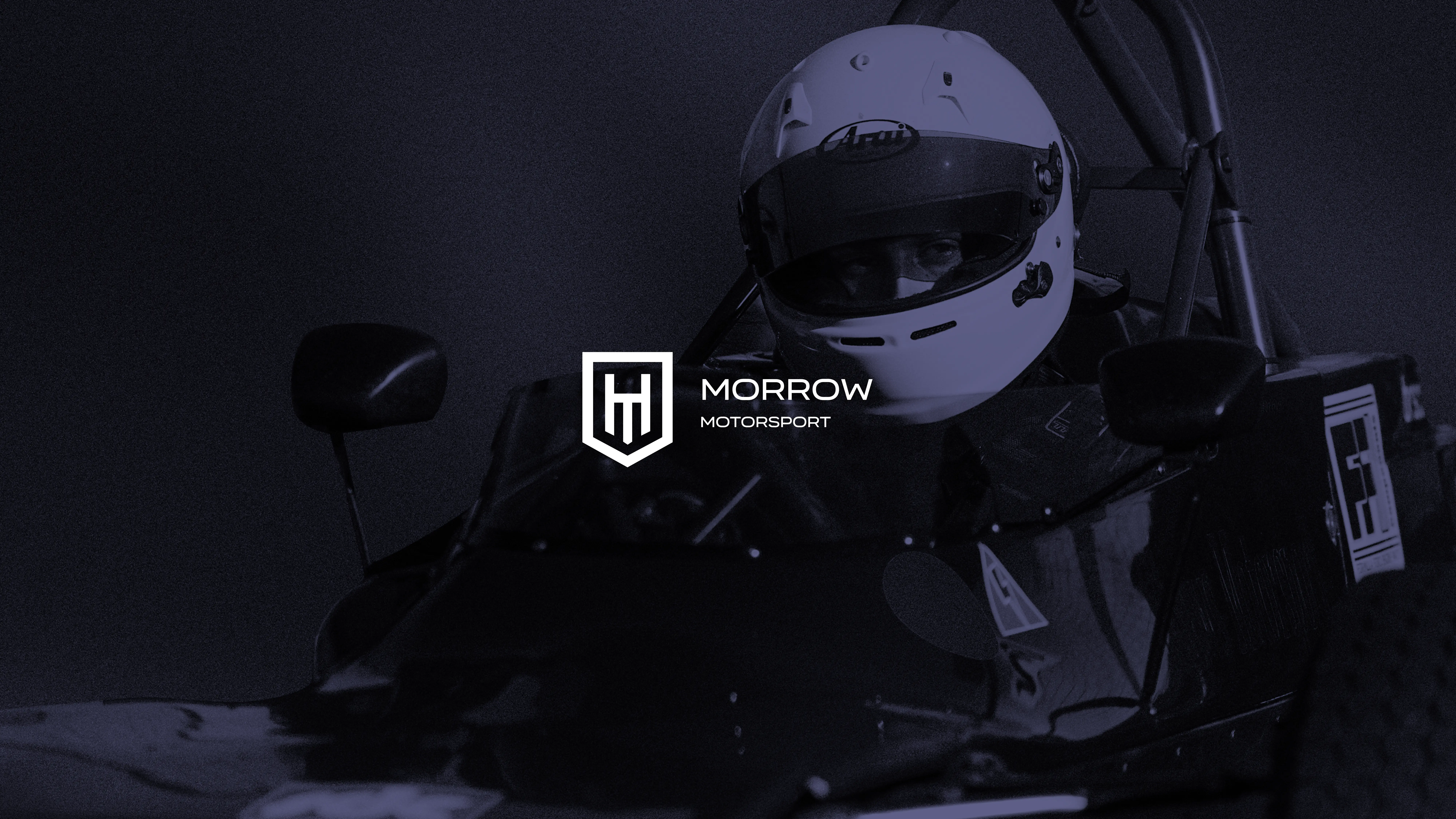
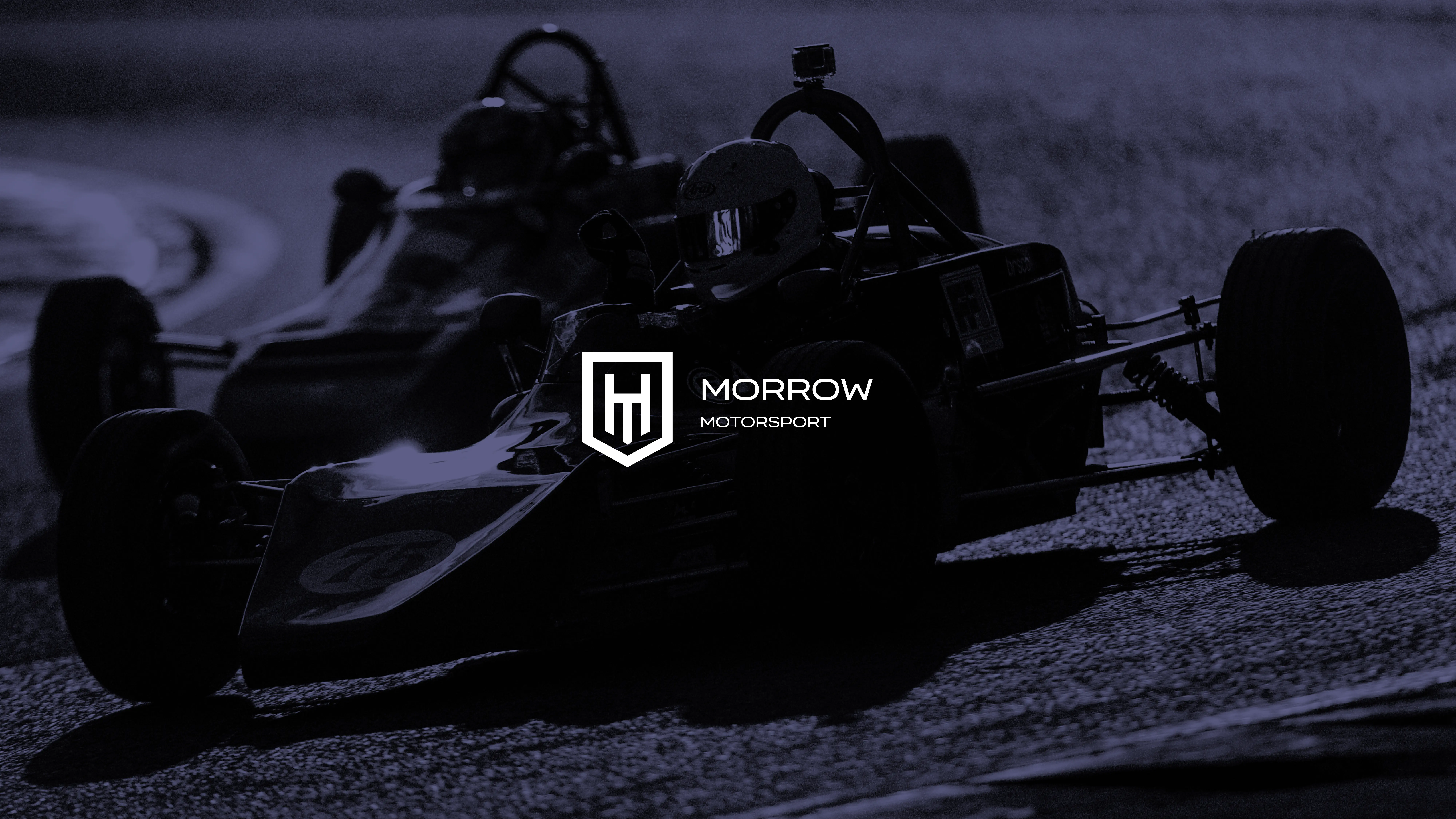
The logomark
The shield crest is the heart of the identity. It holds an interlocked HM monogram — Harrison Morrow's initials — drawn with equal stroke weights so the form reads cleanly at minimum size (36px digital, 10mm print) and scales up without losing precision. The pointed base of the shield gives the mark direction; the internal negative space keeps it legible in reversal.
The primary logo pairs the crest with the MORROW MOTORSPORT wordmark. MORROW leads at display weight — the name comes first. MOTORSPORT follows at a lighter tracking below, establishing hierarchy without competing. The full legal name (Harrison Morrow Motorsport) is reserved for formal and official use; everywhere the brand is seen in public, it's always MORROW MOTORSPORT.
The logo ships in four variants: dark colour (navy + light grey), light colour (grey + gold), black, and white. Each is optimised for a specific background condition, ensuring legibility and contrast are never compromised.
Colour palette
The palette was intentionally minimal — five values, each with a precise job.
ROYAL
BLUE
HEX
#050934
SUBTLE
HEX
#ECECEC
DARK
HEX
#000000
GOLDEN
HEX
#E8A100
LIGHT
HEX
#FFFFFF
The restraint is intentional. Deep navy anchors every surface. Gold appears as an accent — used sparingly so it always lands with weight. No gradients, no secondary palette, no exceptions.
Typography
Two typefaces. One job each.
Organetto handles all headline and display text — set in uppercase, it brings the geometric precision the brand's geometry calls for. The letterforms have motorsport character without being decorative.
Manrope handles body copy and supporting content — modern, readable, and neutral enough to sit beneath the louder brand elements without competing.
Headlines set in uppercase. Body copy in sentence case. No decorative effects, no excessive styling. The type system is built to be followed, not interpreted.
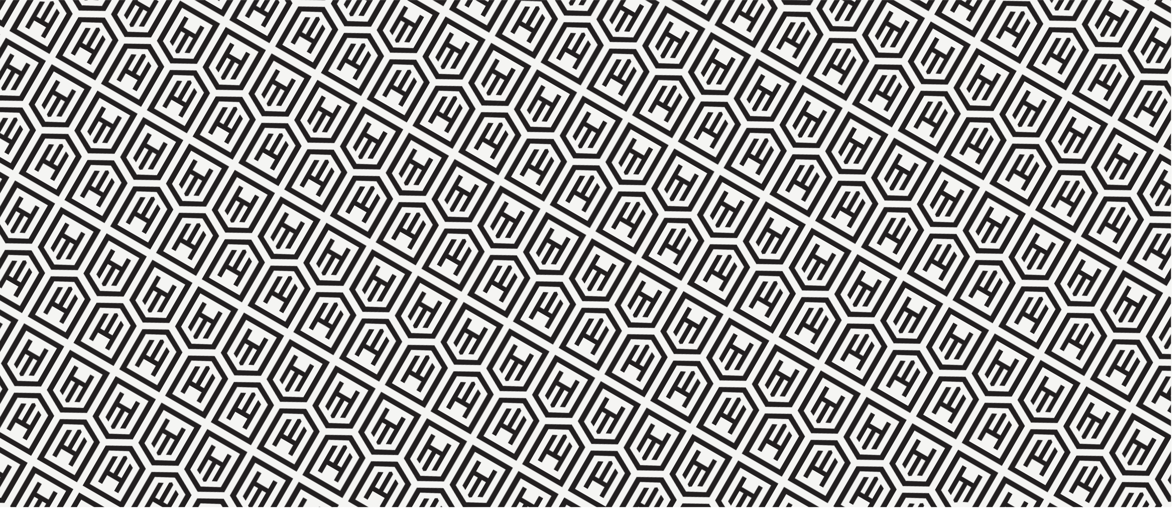
The brand pattern
The repeating pattern is derived directly from the logomark — the shield form tiled into a supporting graphic layer. It can be scaled, cropped or used at reduced opacity depending on the surface. It's never meant to overpower the primary logo or compete with key content; it's the texture of the brand, visible when you look for it.
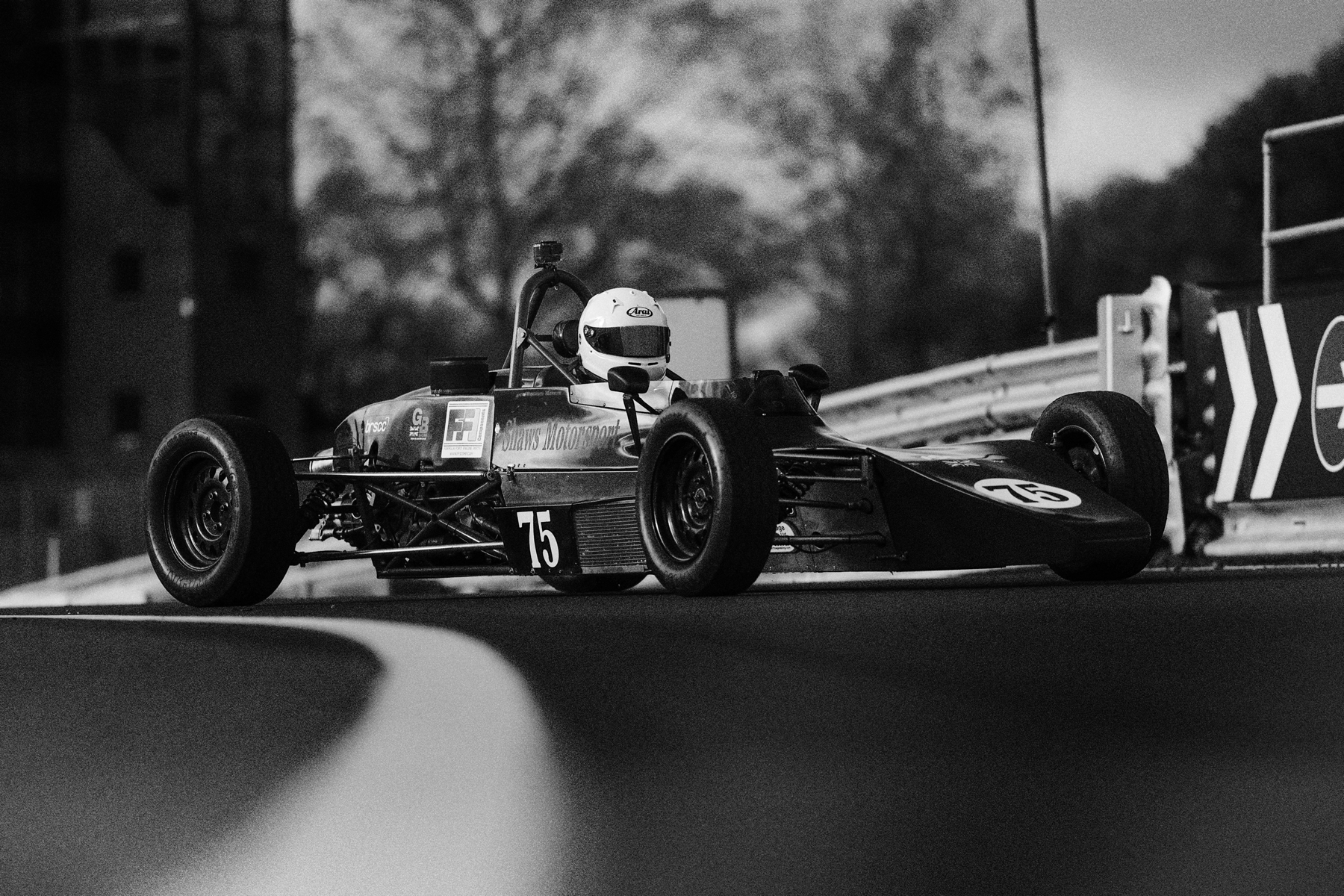
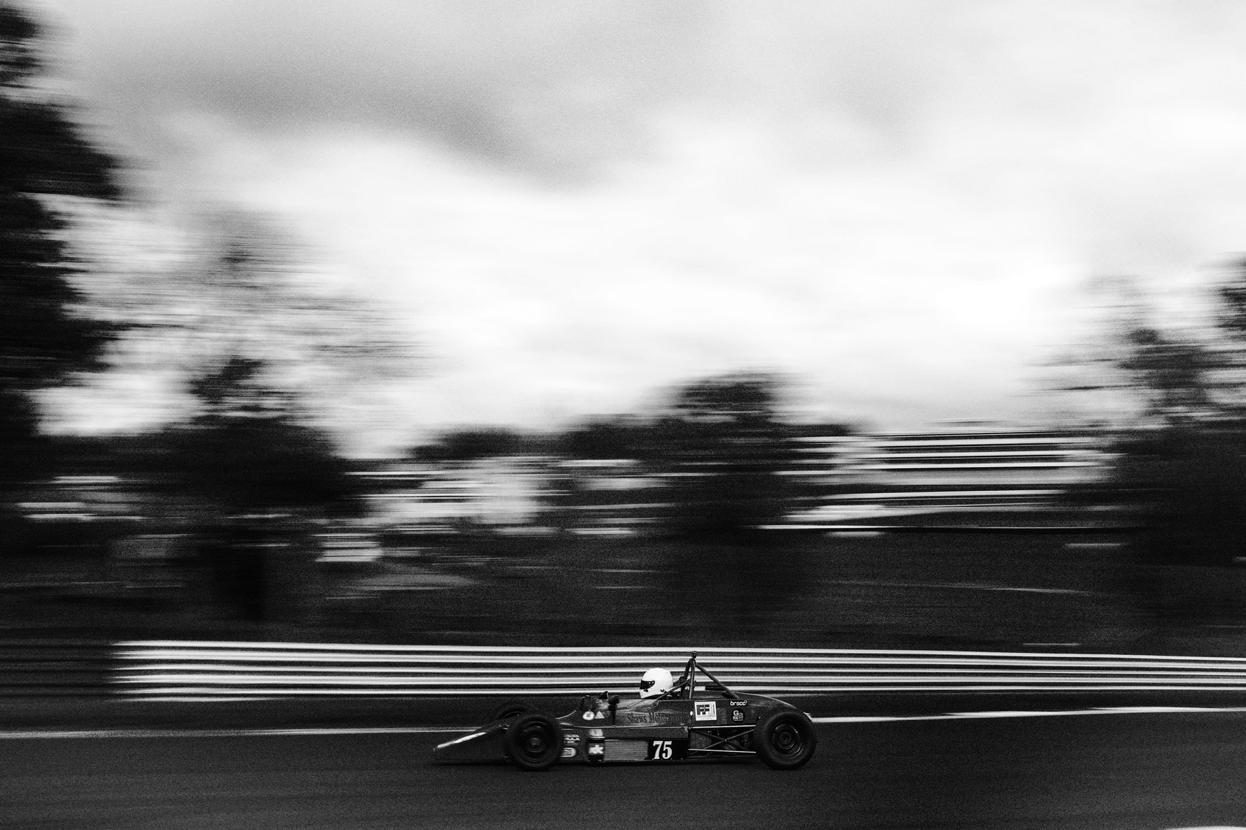
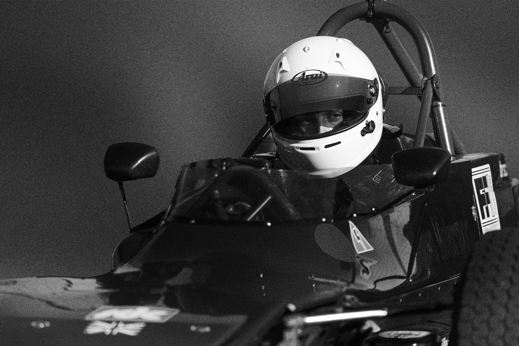
Photography direction
The guidelines define a clear photography standard: black and white imagery, bold and high contrast, minimal. The navy overlay applied across all social templates unifies photographs taken across different circuits, lighting conditions and cameras into a single visual system. The white HM mark sits consistently in the top-left corner — the only constant across every frame.
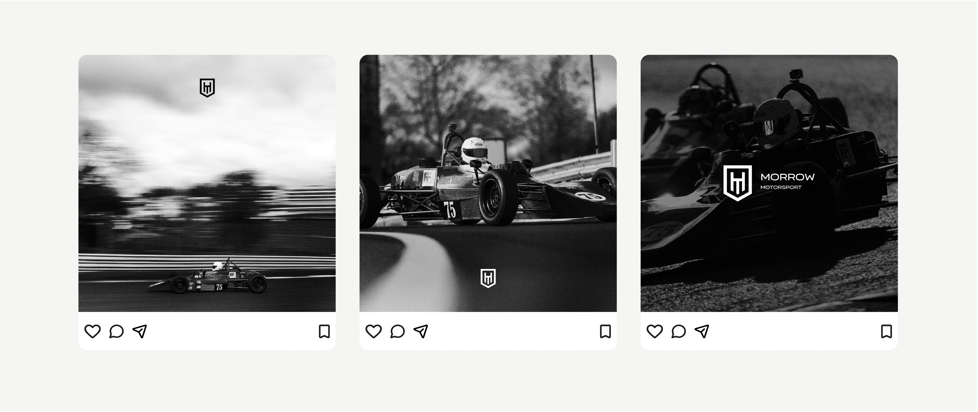
Social media system
The social media deliverable was a production-ready drag-and-drop system — 50 frames across five platform formats, Figma source included. Drop in a new race photograph, the brand does the rest.
| Format | Platform |
|---|---|
| 1080 × 1080 | Instagram / Facebook square |
| 1080 × 1350 | Instagram portrait & Reels |
| 1080 × 1920 | Stories / TikTok / Facebook vertical |
| 1920 × 1080 | Landscape — website, trackside screens |
| 1584 × 396 | LinkedIn profile banner |
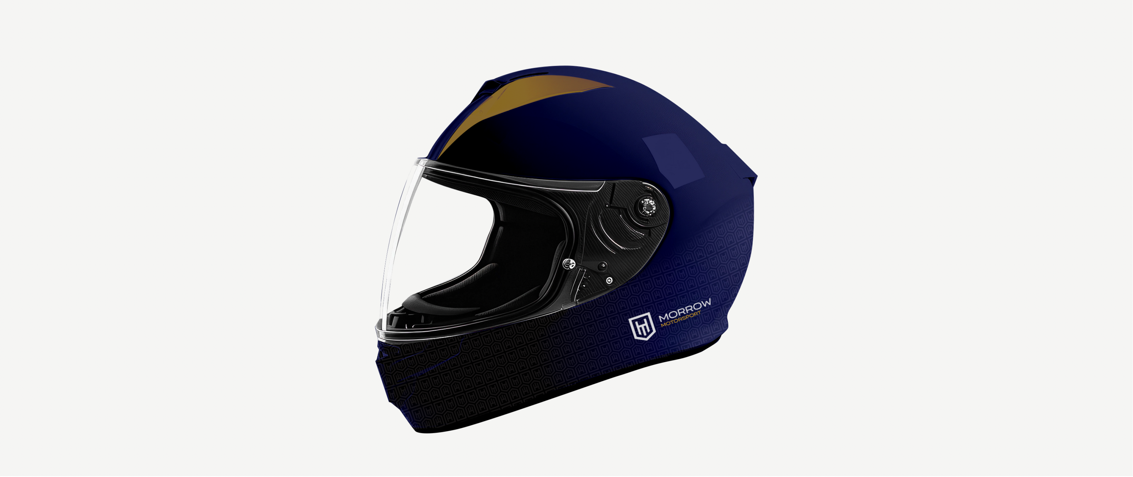
Helmet livery
On curved surfaces — helmets, race suits — the guidelines specify the logomark only, never the full wordmark. The form has to survive curvature and material finish without distortion. The helmet concept uses a navy base, a gold chevron accent, and the white HM crest on the side — the same restraint as the rest of the brand applied to the most visible surface Harrison wears at the circuit.
Deliverables
- Primary logo and standalone logomark — SVG + PNG at 1×, 2×, 3×, 4× — in dark colour, light colour, black and white variants
- Brand guidelines PDF (18 pages) — covering brand positioning, logo usage, colour system, typography, clear space rules, minimum sizes, social media standards and helmet application
- Social media template system — 50 drag-and-drop frames across five formats, Figma source file included
- Helmet livery concept
- Favicon and browser tab assets
Reflection
Motorsport branding has a predictable failure mode: it tries to look fast through speed lines and gradients, and ends up looking like a gaming peripheral. The better call is restraint — let the photography carry the energy, let the colour palette be bold rather than busy, and let the mark be the single thing that holds it all together.
The shield crest does something specific here: it signals that this is a personal brand, not a team. Sponsors and media need to see a driver who has invested in their own image. A crest communicates that. A wordmark alone doesn't.
The next chapter for this identity would be race suit and transporter graphics — the same language extended into the physical surfaces of the paddock.
Additional information
For more on how I approach brand work, please get in touch.