
Scope Utility
A three-direction brand and logo exploration for a Gateshead utility specialist working across smart metering, electrical, gas and renewables.
Scope Utility Solutions Ltd is a Gateshead-based utility specialist providing installations, repairs, smart-metering, gas, electrical and solar work to commercial and domestic clients across the North East. As the company moved into renewables and broadened its commercial footprint, the existing identity — a circular meter-dial mark stuck inside a long, technical-feeling wordmark — was holding it back from being taken seriously alongside larger utility competitors.
This case study walks through the three brand directions presented to the leadership team, the rationale behind each, and how each one would scale across web, vehicles and field collateral.
The brief
The team came with a focused ask:
- Modernise the mark — the meter-dial felt parochial and fiddly at small sizes
- Tighten the wordmark — "Scope Utility Solutions Ltd" was a mouthful; the name needed to flex between formal (legal, paperwork) and friendly (web, social, vehicles)
- Be credible at scale — the brand had to look at home next to British Gas, EDF, and Octopus on a shortlist
- Work on a van — the most-seen surface for the business is a wrapped Volkswagen Caddy on a North East housing estate. If it doesn't read at 30mph, it doesn't work
Where they were
The existing site put the brand's instincts on display: helpful, capable, but visually overcrowded — three trust badges, dense text, and a muted greyscale palette doing little to distinguish the company from a hundred others doing similar work.
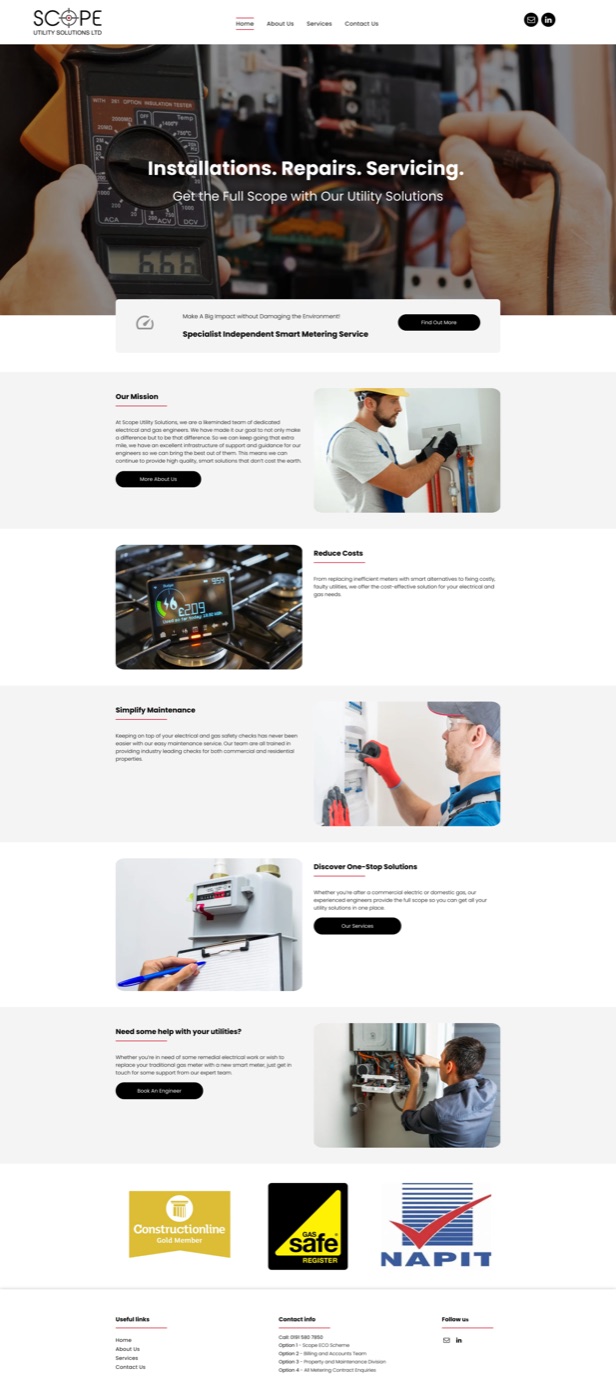
The honest read: nothing here was bad. It just wasn't a brand. It was a website that happened to have a logo on it. The job was to fix the source material.
Approach
Rather than presenting one polished direction and arguing for it, I built three distinct routes the team could react to. Each was developed end-to-end — wordmark, mark, palette, web hero, full-page concept, and a wrapped van — so the conversation could centre on fit, not on whether the idea would scale.
Three directions. One client. Real choice.
Direction 01 — Sphere
A soft, modern gradient mark suggesting completeness, atoms, energy systems — and quietly, the "scope" of the name. Cool blue as the primary, with a confident red accent for action moments.
The thinking: This is the route for a Scope Utility that wants to look like a technology business, not a trades business. Think Octopus Energy, Bulb (RIP), British Gas's recent rebrands. The gradient is friendly without being childish.
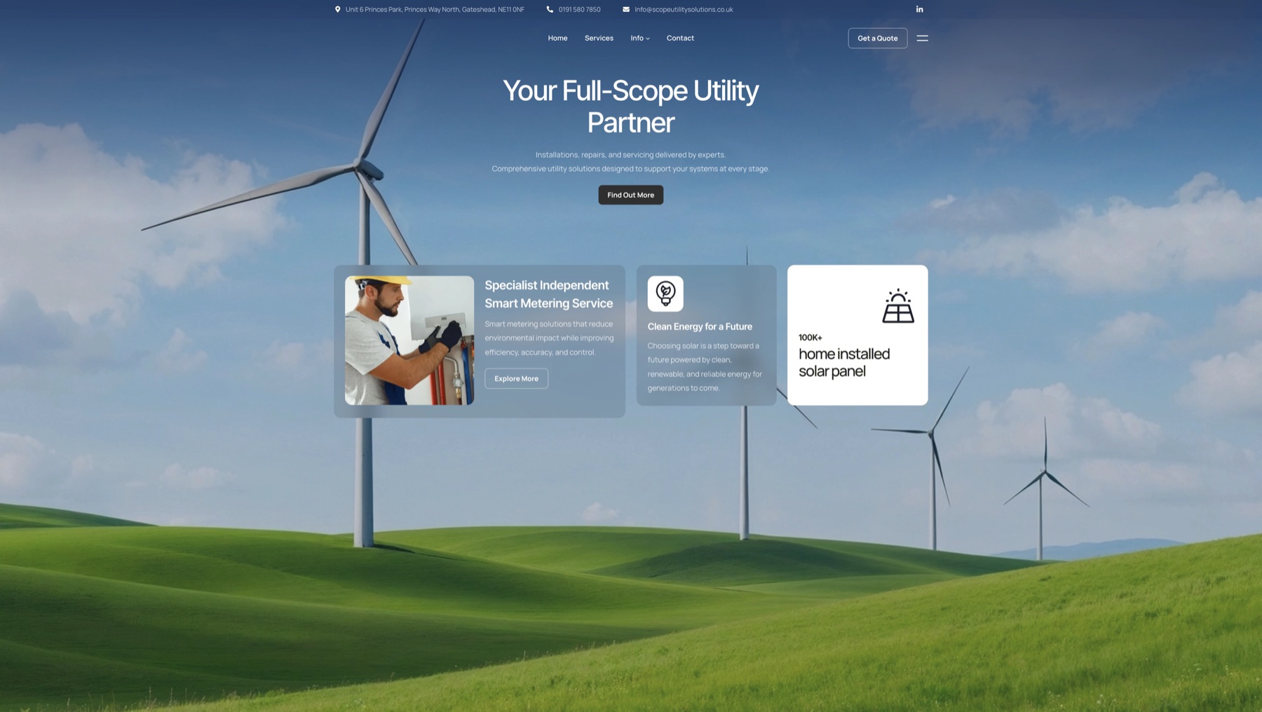
The vehicle wrap leans into the same palette: an angular blue/red/white split that reads cleanly at speed and lets the mark sit on a clean white panel for legibility.

Where it shines: digital surfaces, the website, social, sales decks Where it works hardest: translating to print, embroidery, single-colour use
Direction 02 — Cross
A bold, single-colour identity built around a precise plus / cross mark. Reads as plus, as service, as care, as completion — five things the business wants to mean at once. All-red livery, white reverse, no compromise.
The thinking: This is the route for a Scope Utility that wants to be unmissable. Red is rare in this sector — most utility competitors hide behind green or blue — and the boldness telegraphs confidence. The mark itself is easy to redraw, embroider, and stamp.
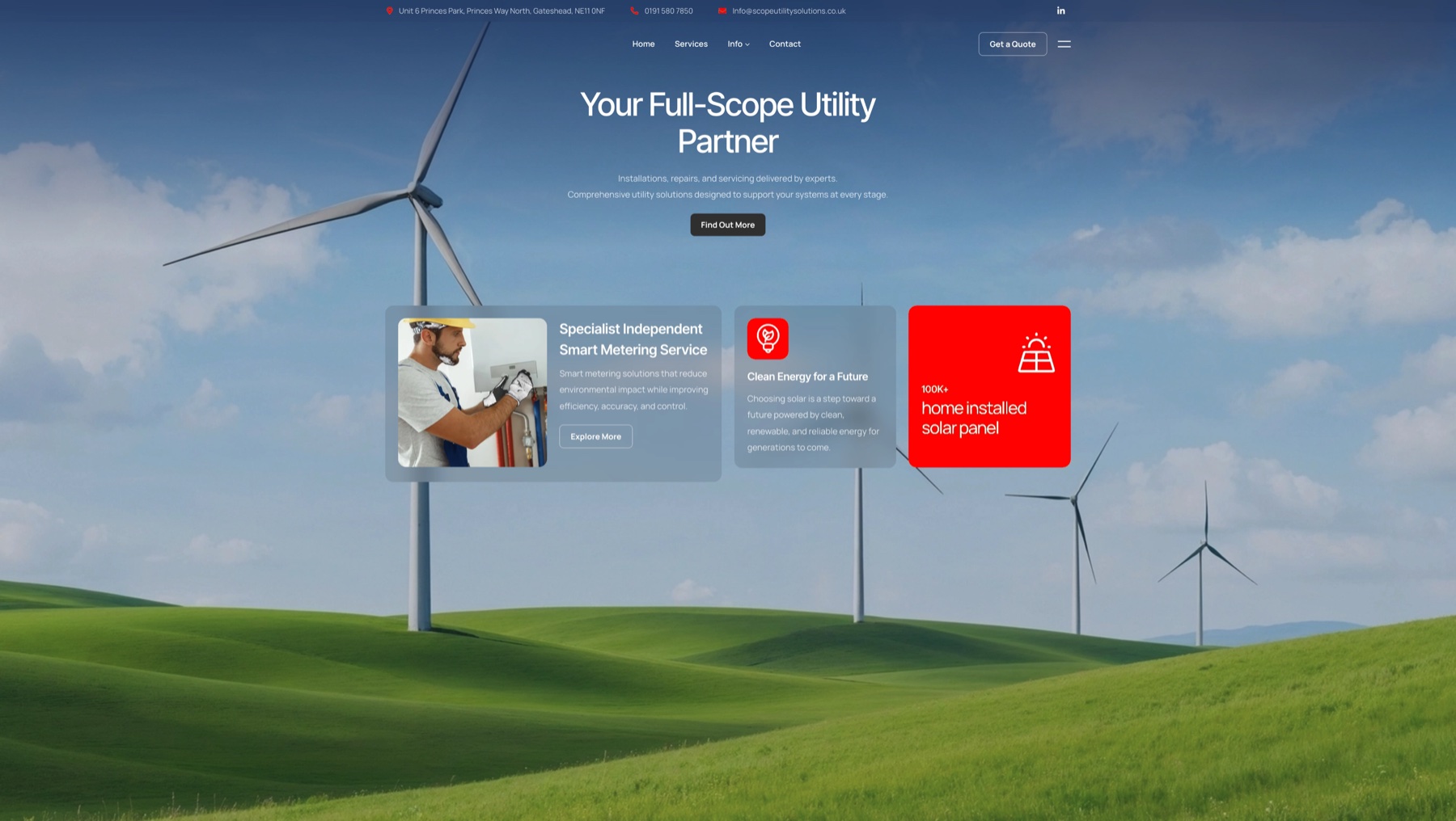
The van is the most arresting of the three: a fully-saturated red shell with the white cross stripe wrapping the rear quarter. You'd see it from three streets away.

Where it shines: vehicles, signage, uniforms, anything outdoor Where it asks for restraint: long-form web — the red has to be rationed, or it shouts
Direction 03 — Stamp
A confident geometric "S" set inside an implied badge — the most "owned" of the three marks. Navy as the workhorse, paired with a high-energy yellow that doubles as a hi-vis nod. This is the route the deck closes on, and the one I'd build out first if it were my call.
The thinking: This is the route for a Scope Utility that wants to feel established — like it's been around longer than it has. The mark has weight. The palette quietly references safety wear without being on the nose. Navy gives it a serious, infrastructural feel; the yellow keeps it from feeling staid.

Applied across a full homepage, the Stamp direction holds together at every scroll position — hero, stats, services, industry tiles, FAQ, footer — without a single section needing to over-explain itself.
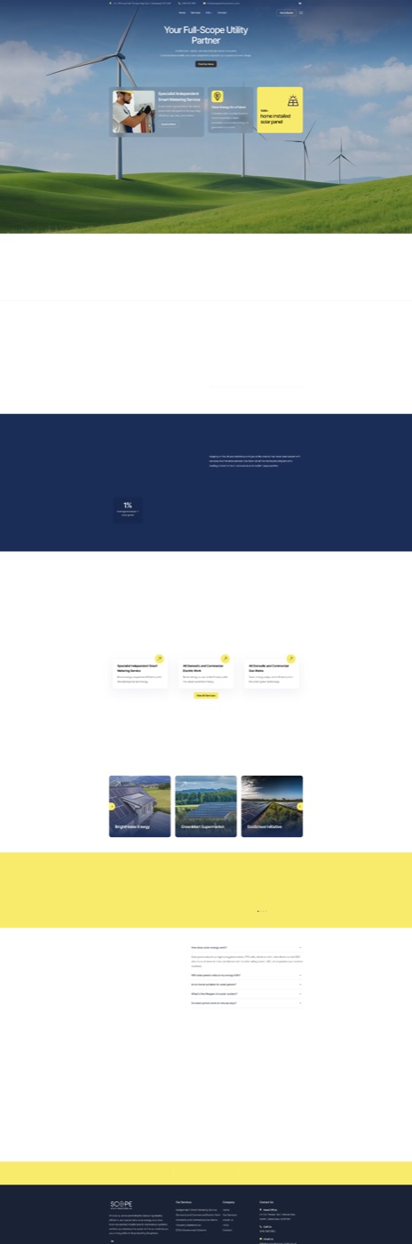
The van completes the picture. Navy body, yellow X-stripe wrap, mark on the door panel and bonnet. It looks like it belongs to a company you'd trust with your meter.

Where it shines: every surface, evenly Where it asks for care: the yellow has a narrow band of correct values — too acid and it cheapens, too mustard and it loses energy
What gets handed over
Whichever direction the team chose, the deliverable was always going to be the same shape:
- Primary and secondary marks, with safe-area + minimum-size rules
- A wordmark in formal and friendly variants
- Colour system with hex / RGB / CMYK / Pantone
- Type pairings for headline and body
- Web hero concepts for the existing site framework
- Vehicle livery artwork ready for a wrap shop
- A short brand book (PDF) covering tone, do's, and don'ts
Reflection
Logo work lives or dies on the strength of the first response in the room. Putting three full-bodied directions on the table — rather than one with two also-rans — is more work, but it changes the conversation completely. The client stops critiquing your one idea and starts choosing between three real businesses they could become.
If I were to extend this engagement, the next move is straightforward: pick the direction, ship the brand book, then carry the visual language back into a rebuilt website and a refreshed set of trust collateral (Constructionline, Gas Safe, NAPIT) so the credentials feel like part of the brand, not stuck on after.
Additional information
For more on how I approach brand work, please get in touch.
